Mockup of the mobile app

CourseCompass

Mobile / UI + UX / Interaction

I designed a mobile app that helps students to find their curriculum interest and create course schedules in my course Interaction Design at University of Michigan.
Team
Zhiyuan Zhang
My Role
Problem framing, User research, Ideation, Selection, Prototyping, Usability testing
Duration
3 months
Tools
Adobe XD, Photoshop, Miro, paper

The Problem

Every student needs to plan their courses. However, finding the information they need can be hard. It is difficult to know what the courses are actually like and how they can relate to students' careers merely from course statistics and syllabus, not to mention that information is often spreaded across multiple resources.
So, UM students need more efficient ways to make informed decisions on course planning.

Target Audience

All UM students who have needs in course planning.

Goal

Create a user-friendly tool to help UM students find schedule and make informed decisions on course planning.

Context and Environment

User
Usually busy, relatively comfortable with technology and information
Technology
Access to computer and mobile
Social Aspect
Usually in individual, both incoming students and senior students
User Environment
Both on-campus and off-campus

Design Process

User Interviews

To better empathize with my users, I interviewed 5 students from different majors and grades. These interviews uncovered new perspectives and needs that I hadn't realize before. I found out that students use up to 5+ resources to plan their courses, and some resources are hard to find. Furthermore, friends' recommendations are a major factor when planning for courses. This could infer possible troubles for students who don't have a lot of connections in their programs, especially for incoming students. Plus, I found that most students care most about what courses would align with their interest and help them progress towards their career. Then, I categorized my key findings based on Maslow's hierarchy of needs.
Basic
  • Students need a platform that integrates course-related information.
  • Students want easy ways of finding courses that fit their schedule, avoiding conflicts and planning courses (both short and long terms).
Psychological
  • Students need to hear more for advice from peer or senior advisors.
  • Students want to hear experiences from previous students who have taken the courses.
Self-fulfillment
  • Students want to know what courses closely related to their interest fields.
  • Students want to which courses can help them gain a career in their interest fields.

Personas

Based on the insight I got from previous needfinding interviews, I created 4 personas for my product. These personas helped me clarify my main design goal: provide students enough information for them to get in-depth insight about courses and allow them to explore courses that align with their interest / career goal. At the same time, I also want to consider the needs of the students who only want to build schedule quickly and easily.

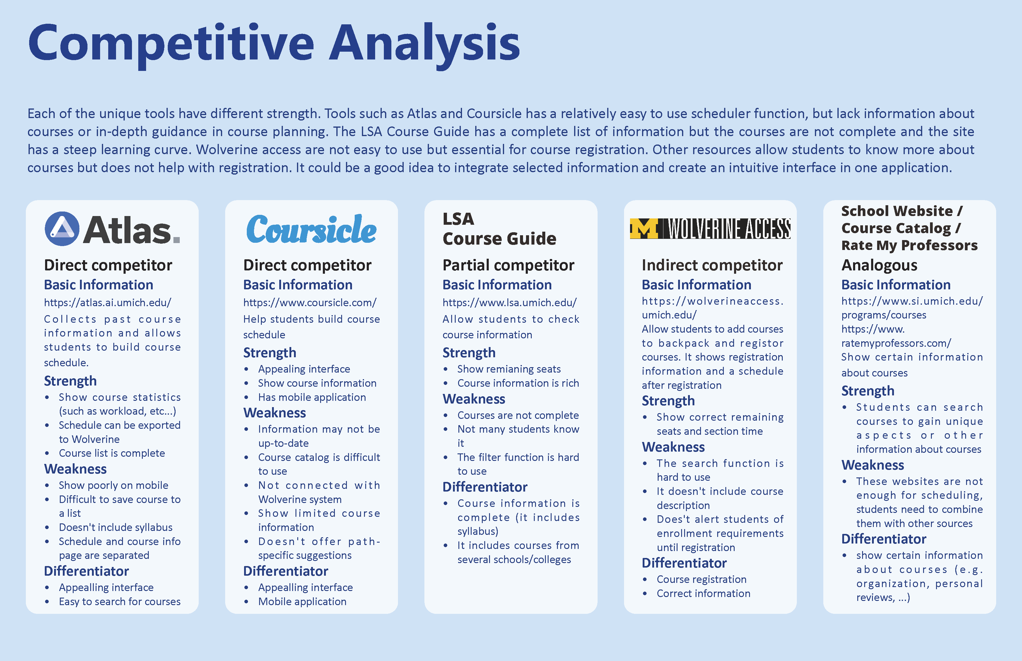
Competitive Analysis

To know more about the resources that students use, I did a competitive analysis. I found that each of the tools have different strength. But there is not a tool that integrates all the information students look for. Atlas and Coursicle have relatively easy-to-use scheduler functions, but they lack in-depth perspectives about courses. The LSA Course Guide has relatively comprehensive information, but the course list is not complete, and the site is uneasy to navigate. Wolverine Access is not easy to use but is required for course registration. There are other resources that show different perspectives about courses, but the amount of information is very limited. So, it naturally comes to me to select critical information around course planning and integrate them in an easy-to-use application.

QOC Diagrams

After thoroughly framing the problem, I ideated 8 tools that may reach my goal, then I created 3 QOC diagrams to narrow them down.
  • The first diagram targets towards the basic needs of the users - how to help them schedule their courses.
  • The second diagram targets towards the psychological needs of the users - to get more in-depth insights about courses and make informed decisions about course planning.
  • The third diagram targets towards the self-fulfillment needs of the users - to find their interests based on the courses they have taken and find courses that align with their interests and career goals.
Based on the results of the QOC diagrams, I selected the interactive schedule builder with holistic course information and explorative fields listings as the first iteration of my design system.

Narrative Storyboard

After I determined my initial design system based on the QOC diagram, I reviewed my needfindings and personas. And I created 4 scenarios for each of my personas and 1 storyboard for my primary persona.

The purpose of creating scenarios and storyboard at this stage was to develop deeper understanding and details of the context of use and to make sure that my design system aligns with the users' needs and goals. In this process, I clarified the time and location where users would use my product. It also reminded me that incoming students may not be the primary user of this product, because they usually have to take required courses in the first semester.

Story Mapping & User Flow Diagram

After I created the scenarios and storyboard, I created 4 story maps for each of my persona and a common story map.
When I was building the story map, I found that the primary users would use most features and other personas would use different features. The order of the use of each feature is not necessarily in serial, so I chose the order that makes most sense to me when constructing the story map.
Because each persona uses different features, and they may use the features in any order, I decided to design a tab bar Application. So, it will be easy for users to navigate to each tool in the application.

Prototyping

After constructing a user-flow diagram, I made a low-fidelity prototype. I made the prototype interactable, so that I can do some early testing and get feedback.

I did 5 micro-usability tests. One problem is that the function of each icon on the tab bar is not clear, so I put description fields below them in the mid-fi prototype. Another feedback I received is that the sample academic plan is very useful, so I made it interactive. Meanwhile the profile page is not used very often, so I replaced it with the interactive plan. I also made a few changes to the UI design. This was the mid-fi prototype I made.

Now that the mid-fi prototype is more interactive and complete. I did a few usability tests again and get some new feedbacks. Based on the feedback, I evaluated the current design critically and decided to add a few more features. At the same time, I was not satisfied with the UI design, so I read Google's material design guideline, and this was the hi-fi prototype I made.
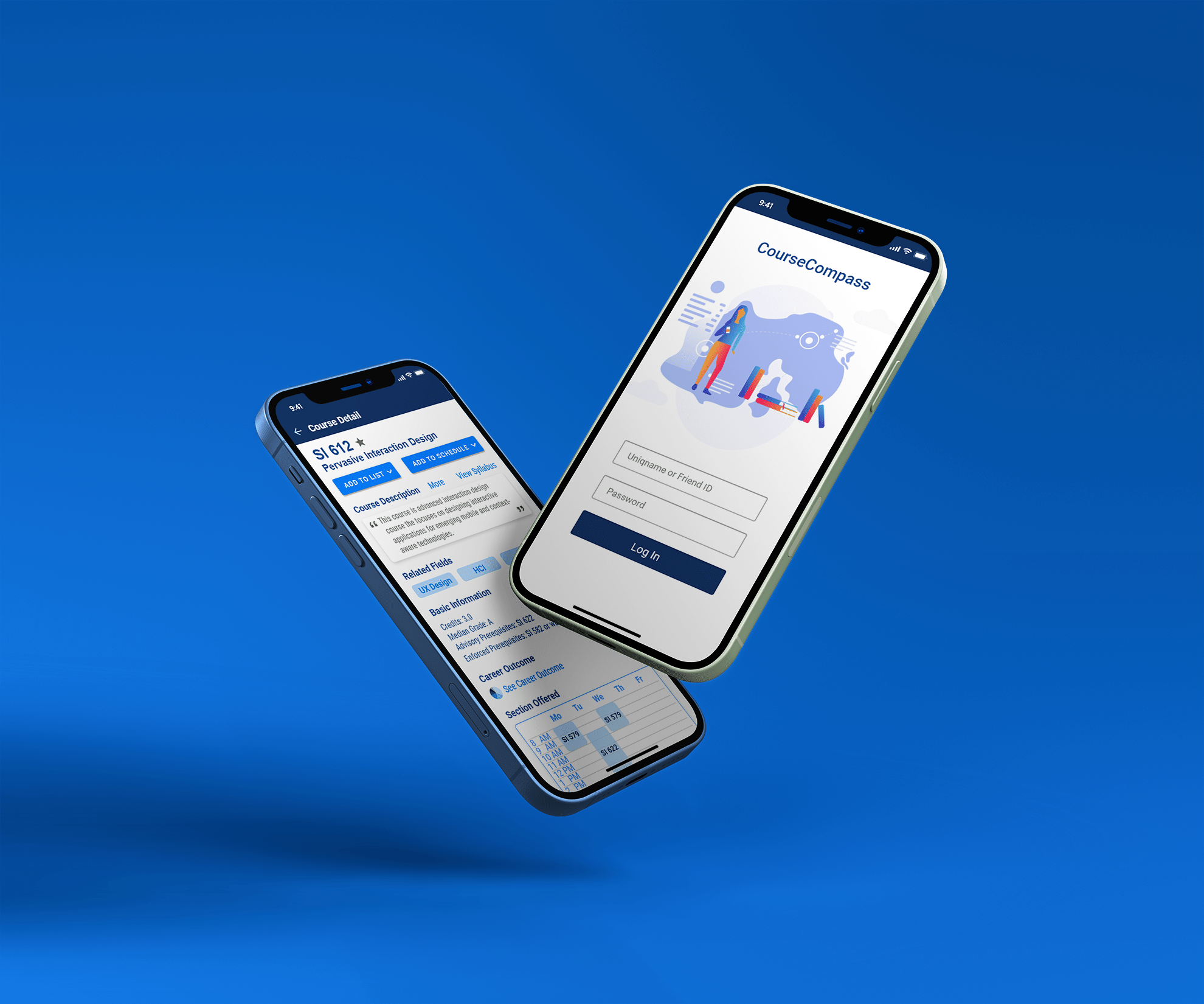
Key Features

Holistic Course Information

The course information page includes information that students care most beyond basic logistics, such as career outcome, instructor's web page, project showcase, student reviews, etc. This information provides valuable insights on students' development and is hard to obtain elsewhere. Furthermore, the reviews can be filtered to reviews from students with similar backgrounds by machine learning algorithms. Because the same course could be of completely different difficulty to students with different backgrounds.

Interactive Academic Plan

This feature is designed to solve students' needs of long-term planning and determine their future paths. The plan shows a sample plan with required and recommended courses initially. Students are allowed to add/remove courses from the plan. The tool provides an easy way for students to plan in advance and find their desired path more easily. Because once they have made a plan, they would know better what their goals are and be more persistent towards their goals.

In addition, the system checks pre-requisites and other enrollment requirements automatically. It also prevents students struggling to meet graduation requirements in their last semesters.

Course Listings by Fields

This feature allows students to explore the fields they are interested in. They can see the required and key courses related to the fields. In this way, they can know whether they want to pursue further in the field based on the courses in the listing and what courses they may take in the future.

I decide to give this feature an important role because my biggest design goal is to help students find their interest. I want to encourage students explore on their own instead of relying too much on the recommendation system because this is an important decision they should figure out on their own. Meanwhile, my tool would make the process as easy as possible.

Course Eligibility Checklist

This feature helps students generate schedules easily by automatically checking enrollment requirements and time conflicts. Students can add sections/courses to the checklist, and the checklist would find a workable schedule for them. If no workable schedule can be found, the system would tell students what courses conflicts. This would be helpful when courses have many sections. To enhance the inclusiveness and usability of the app, the app also allows students to choose their preference, such as class time and instruction mode, for the system to make general more personal schedules.

Final Thoughts

Technical Feasibility

The design is technically feasible. Because the requirements of courses can be easily loaded into a database. Algorithms like topological sort can be used to check the prerequisite of courses. The course and field recommendation system would use student-course pairs to recommend courses to students based on their past courses, similarity to other students and the rating they give to courses in the system.

Reflection

This was my first complete design experience, and I learned a lot from it. Here, I want to list three lessons I learnt.

One lesson from my needfinding interviews was that not all users are like me. Some students tended to make careful decisions before choosing classes and some just chose randomly. It was also different how each student feels about their interest level of their paths. The needfinding interviews broadened my perspective and made a foundation for my following steps.

Another lesson I learned was to speak with different people, whether it's about knowing the problem and the users more or about the design itself. I think speaking with other people, learning their perspective and listening to their advice helped me refine my design.

Last but not least, I think it was very helpful to be critical about the design throughout the design process and keep thinking deeply about the goals and needs of users. Sometimes, just rethinking the design features and the goals can give me inspiration.

Challenges

One of the biggest challenges was to make my design differentiate from the competitors. There were plenty of resources that were referenced by students. It took me efforts to know what students really needed and what the existing resources couldn't provide.

Another challenge was to discard the bias of myself as a designer and to really listen to the perspectives of different students. Because I was also a student, I always reminded myself to leave my opinions aside and accept users' opinions.

For Future

I learned a lot in this project, whether its design thinking or software skills. In the future, I will adopt better prototyping workflow. I will use atomic design methods, such as first creating a component library of basic components, then determining the layout of each screen and refining the visual details at last.